Since its inception the National Portrait Gallery has pursued an ongoing program of commissions. Commissions are an opportunity for the Gallery to develop its collection and to represent sitters of whom no desirable portrait exists.
The commission process allows the Gallery to bring together distinguished individuals with highly regarded contemporary artists to create powerful and insightful portraits. Previous commissions have become iconic works, such as the elegant portrait of HRH Crown Princess Mary of Denmark by Jiawei Shen, the dramatic photographic portrait of opera conductor Simone Young by Bill Henson, the playful ceramic bust of Dr John Yu by Ah Xian, and the cult-status cementing image of musician Nick Cave by Howard Arkley. Arkley’s bold and intense portrait of Cave was recently included in a major touring exhibition of the artist’s work, and it was one of the stand-out works in the show.
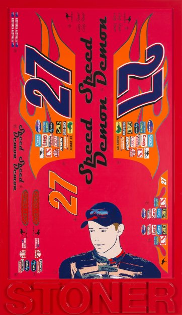
Most recently the Gallery has commissioned a group of works by leading contemporary Australian artists which are featured in the National Portrait Gallery’s new building opening display. Petrina Hicks’s serene photographic portrait of champion surfer Layne Beachley emphasises the sportswoman’s intensity. Photographer Deborah Paauwe has created an intimate portrait of fashion designers Sarah-Jane Clarke and Heidi Middleton, the creators of label Sass & Bide. Social commentator, cartoonist and animator Bruce Petty has created an animated self portrait, and artist David Rosetzky has worked with choreographer Lucy Guerin and sound designer and composer David Franzke to create a major digital-video portrait of actor and theatre company director Cate Blanchett. Included with the portrait commissions to be featured in this display is Brisbane-based artist Scott Redford’s exciting portrait of young sportsperson Casey Stoner. Drawing on the tradition of Pop Art and using the techniques of contemporary graphics and signmaking, the portrait is a bold interpretation of Casey Stoner’s public persona.
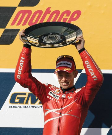
Casey Stoner, professional motorcyclist, was born in Southport, Queensland in 1985. Stoner was named the 2008 Young Australian of the Year after winning the MotoGP motorcycling world championship in 2007. Stoner first competed when he was four years old, and by the time he was fourteen he had won forty-one dirt and long track titles and seventy state titles. Because the legal age for road racing in Australia is sixteen, in 1999 his family moved to the UK, where he could legally compete from the age of fourteen. From 2000 onwards Stoner competed in the 125cc and 250cc classes, and in 2007 he joined the Ducati racing team. His World Championship win made him a household name in Australia, where the combination of his youthfulness and his extraordinary racing talent has gained him great popularity. He won his second straight Australian MotoGP Championship in 2008.
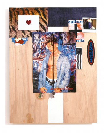
Scott Redford, born in the Gold Coast, Queensland in 1962, is an influential contemporary artist who has been exhibiting since the early 1980s. His work is represented in all major collections in Australia and has been included in important international exhibitions. Redford’s work is unique in its references to international art movements including Colour Field painting, Conceptual art and Pop Art, its engagement with local themes such as Australian art history and vernacular architecture, and its accessibility to a broad audience. Redford has used images of iconic actors and musicians including Keanu Reeves and Kurt Cobain to comment on popular representations of masculinity, and has worked with surfboard technicians to produce ‘surf paintings’ that articulate the glossy appeal of surfboards. I recently engaged Scott in a discussion about the commission.
The National Portrait Gallery had been interested in inviting you to create a portrait commission for some time, and it seemed to us that asking you to create a portrait of Casey Stoner was a natural fit. Could you describe how you developed the concept for the portrait?
I was very well aware of Casey Stoner and had been impressed and amazed at how young he was and looked. He looked so boyish but was obviously someone of unique ability and drive. It was astounding really and it was great fun to behold. When the National Portrait Gallery approached me about a portrait of Casey I searched the Internet for images of him and found that whilst there were a few photographic head shots of Casey most images were of him on his bike during races. What struck me vividly was that whilst I knew I was looking at a racing bike rider on a bike what I really saw was a huge mass of logos under which was a man and a bike. Casey is logo city! So I decided that I wanted to play up this logo-mania and also make a portrait of Casey’s face but one that had become almost a logo too. I wanted to embrace the visual styling of Casey Stoner as he presents himself to us the public. With my designers, we invented a set of new logos especially for Casey. I didn’t want to critique Casey’s image at all because in creating a public image and persona a person has already engaged in a form of critique even though it may seem to be a blind embrace. Nothing is simple in this world and sometimes it’s best that an artist simply goes with the flow. Orthodox contemporary art ‘critique’ can be awfully lazy at times and there for the sake of being there.
I think it is a celebratory, fun portrait that really conveys a sense of youthful vigour. That is evident in Casey’s own persona, as well as in your use of decals, stickers and graphics. As an artist you have always had a fascination with using collaged and combined imagery, including stickers and decals. Recently you have been making work inspired by decal-sets for model motorbikes. What is it about stickers and decals that appeals to you?
Well it’s not just me. I find that the stickers and decals (and the posters and guitars, etc. I use) really draw viewers in immediately. I like that I can quickly get a visual response and an emotional one as people are immediately transported back to their childhood or adolescence as they remember their own sticker collections and toy plane or racing car making. In the 1990s I made a more cerebral conceptual type of art that didn’t draw people in as much, indeed it probably repelled many. That wasn’t my intention and when I realised what was occurring I changed tack. Art is about communication … and it’s about fun.
There’s also a recognition factor in your materials. You are well known for working closely with designers from specific professions. You have had professional model-makers assist you with your Gold Coast ‘Las Vegas’ signs. You have worked closely with surfboard-makers and explored developments in using paints and resins on surfboard surfaces. And lately you have produced editioned sculptures using ceramics. As a closing question, can you sum up your relationship with the graphic designers who assisted you with this work. And where do you see it taking you?
Well at present I’m working with a whole group of collaborators in making a full scale Las Vegas-type road sign for Brisbane’s Gallery of Modern Art. My graphic designers are very important to me obviously. Ray Smith has had the most influence. Ray was a signmaker in Brisbane for over two decades and he is quite amazing and very generous – all my fabricators are extremely good to me in fact, sharing their time and enthusiasm, I’m very grateful to them. Without Ray I couldn’t make the signage models and the decal works as Ray has the deep knowledge of vintage fonts needed to do the replicated digital work. It was Ray who taught me that 1950s roadside lettering is very different to today’s. The older lettering was much bigger in its allotted space in the design, it needed to be to stand out. Older MOTEL letters strain at the edges of the squares they sat in so as to get the drivers’ attention. They shout at you. Much contemporary signage is really poor as there is no distinction made for the same fonts used at different scales. Ray is a stickler for font design which is important as we often have to redraw fonts. Ray also can work out if a font has been customised as many were hand drawn in the pre-digital age. For the decal works I rely on Ray and also Louise Mathews and others at M Creative who are making the Casey work. Louise has actually laid down laser-cut vinyl and is now designing and I always am very conscientious to do what they think will work best: which colours work best and are boldest. I am actually very conservative this way. I rarely do anything unusual and I find it best to work with the prevailing practices than against them. However I do insist on getting the best possible product which means no skimping on cost. My fabricators are grateful for this as it allows them to make work they rarely can. I say to them: ‘You know when signage is so good it is almost art? That is what I want.’ And they understand. We all get very excited in making our pieces. We’re all very proud of them.
